.svg)

FORTH
We designed a bold and minimal logo for Forth, capturing the brand’s forward-thinking spirit and commitment to innovation through simple, powerful design.
tHE CHALLENGE
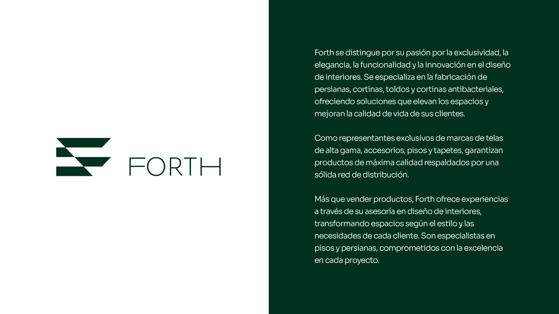
Forth needed a distinctive visual mark to represent its modern and progressive identity. The main challenge was to create a logo that conveyed movement, vision, and professionalism without relying on complex elements. The goal was to design a symbol that could adapt to different uses while remaining memorable and timeless.
OUR SOLUTION
We developed a clean typographic logo that embodies direction and progress. The design focused on geometry and precision, balancing minimalism with strength. The final result is a versatile mark that functions effectively across both digital and physical formats, laying the foundation for a cohesive future identity.
Results That Matter
0
Engagement Rate
0
Follower Growth
0
Reach
_Pa%CC%81gina_01.jpg)
_Pa%CC%81gina_34.jpg)
_Pa%CC%81gina_33.jpg)
_Pa%CC%81gina_31.jpg)
_Pa%CC%81gina_18.jpg)
_Pa%CC%81gina_30.jpg)
_Pa%CC%81gina_29.jpg)
_Pa%CC%81gina_28.jpg)
_Pa%CC%81gina_25.jpg)
_Pa%CC%81gina_23.jpg)
_Pa%CC%81gina_20.jpg)
_Pa%CC%81gina_12.jpg)


